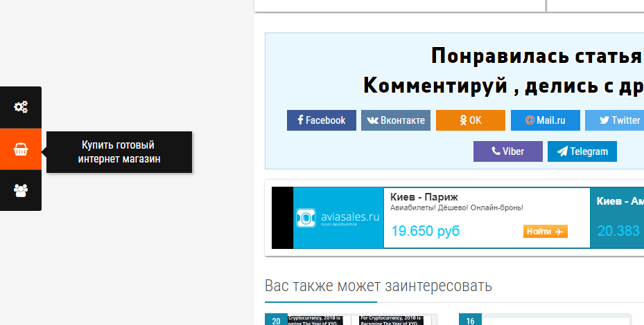
Greetings to you dear visitor of our site. In today's short article, we'll talk about how to add stylish side buttons to your site.
Side buttons on the webmaster's website are used in different ways, who then displays links to important sections of their Internet resource, who adds social network buttons for links to their pages in social networks, whoever uses buttons to display widgets or any other information on this is for what and how to use the buttons on the side of the site everyone decides for himself, today we just discuss how to add buttons to the side of any site.
To solve this problem, we need the smallest, it's a few lines of HTML and a few lines of CSS code. In this example, we will not use any complicated JS scripts, but rather create side buttons on pure CSS.
You can see the example at the bottom of this page in the same place and you can download the ready-made side buttons and just install them on your site by copying the necessary sections of the code, and so let's get started.
As I wrote before, we will do stylish side buttons without using JS scripts, and without using any pictures, but since we need to make the buttons more presentable, instead of the icon images we will use the icon font Font Awesome, so check if you already have this font on your site, if not already connected, then use the information from our previous publication where it is described in detail how to connect to your website font Font Awesome.
And so let's say that the font Font Awesome is already connected to you, it's good, what's next, and then we add to your site for example right after the <body> the following HTML markup:
|
1 2 3 4 5 6 7 8 9 10 11 12 13 14 15 |
<div id="left-buttons"> <div class="buy-supplement"> <a class="field-tip" href="#" target="_blank"><i class="fa fa-shopping-basket" aria-hidden="true"></i><span class="tip-content">Buy Template</span></a> </div> <div class="admin-panel"> <a class="field-tip" href="#" target="_blank"><i class="fa fa-cogs" aria-hidden="true"></i><span class="tip-content">Admin panel<br>login and password: demo</span></a> </div> <div class="documentation"> <a class="field-tip" href="#" target="_blank"><i class="fa fa-file-text-o" aria-hidden="true"></i><span class="tip-content">Documentation</span></a> </div> <div class="support"> <a class="field-tip" href="#" target="_blank"><i class="fa fa-users" aria-hidden="true"></i><span class="tip-content">Technical support </span></a> </div> </div> |
Well HTML markup with buttons is added, the next our task will be to make a beautiful display of our side buttons, and for this in the main your style file add the following code:
|
1 2 3 4 5 6 7 8 9 10 11 12 13 14 15 16 17 18 19 20 21 22 23 24 25 26 27 28 29 30 31 32 33 34 35 36 37 38 39 40 41 42 43 44 45 46 47 48 49 50 51 52 53 54 55 56 57 58 59 60 61 62 63 64 65 66 67 68 69 70 71 72 73 74 75 76 77 78 79 80 81 82 83 84 85 86 87 88 89 90 91 92 93 |
@media only screen and (max-width:992px) { #left-buttons { display: none; } } @media only screen and (min-width:992px) { #left-buttons { display: block; left: 0; position: fixed; top: 20%; width: 60px; z-index: 100; } #left-buttons div>a { background: #141414; border-top: 1px solid #4c4c4c; display: block; height: 60px; text-align: center; } #left-buttons div.buy-supplement>a { border-top: 0; border-top-right-radius: 3px; moz-border-radius-topright: 3px; webkit-border-top-right-radius: 3px; } #left-buttons div.support>a { border-bottom-right-radius: 3px; moz-border-radius-bottomright: 3px; webkit-border-bottom-right-radius: 3px; } #left-buttons div>a:hover { background: #ff5100; } #left-buttons div>a i { color: #fff; font-size: 18px; line-height: 60px; } } .field-tip { position: relative; } .field-tip .tip-content { background: #141414; box-shadow: 2px 2px 5px #aaa; color: #fff; margin-right: -220px; moz-box-shadow: 2px 2px 5px #aaa; moz-transition: opacity 250ms ease-out; ms-transition: opacity 250ms ease-out; opacity: 0; o-transition: opacity 250ms ease-out; padding: 10px; position: absolute; right: 9999px; top: 4px; transition: opacity 250ms ease-out; webkit-box-shadow: 2px 2px 5px #aaa; webkit-transition: opacity 250ms ease-out; width: 200px; } .field-tip .tip-content:before { border: 8px solid transparent; border-right-color: #141414; color: #141414; content: ' '; height: 0; left: -16px; margin-top: -8px; position: absolute; top: 50%; width: 0; } .field-tip:hover .tip-content { opacity: 1; right: 0px; } |
Well, basically everything, now you have on the site on the left side will be beautiful beautiful side buttons, the appearance of which you can correct using the added code of CSS styles. use on health.







No Comment
You can post first response comment.