Greetings to you dear user on his website. When that, I already talked about how to add tooltips on CSS, But today I wandered around the internet and came across cool pop-up hints when hovering. A bit of testing them, I thought that maybe someone like that, hints on a clean css for your site just like that.
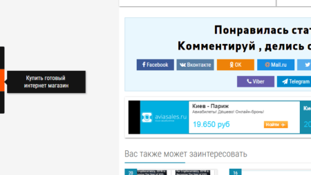
These tips can be used almost to any button on the site, or to any word combination, picture, and in general to anything, but for example, the tooltips on the site are used for social buttons, when hovering, a cool text prompt appears.
It often happens that there are a lot of different blocks, texts and other useful content on your site that can confuse the user, that's where the help pop-up help comes in, they can provide some information for some site or button on the site.
In this article I want to share with you wonderful tips on hovering, and just for yourself to make a note for the future, and suddenly come in handy :). In the article, I will not just give you the sources, but also describe a little with what to eat, how to set up hints on the site, how to connect them, in the demonstration you can look at their different effects, etc. ...
Here is a roughly similar view will have a pop-up bookmark on your site:
In general, proceed, and first we need to create HTML markup for our animated site tips, create a li list that will look something like this:
|
1 2 3 4 5 6 7 8 |
<ul> <li><a href="#"><span>Google Plus</span></a></li> <li><a href="#"><span>Twitter</span></a></li> <li><a href="#"><span>Dribbble</span></a></li> <li><a href="#"><span>Facebook</span></a></li> <li><a href="#"><span>LinkedIn</span></a></li> <li><a href="#"><span>Forrst</span></a></li> </ul> |
Well, in the first point of the complex there is nothing, I think everything is clear, now let's get down to a more complex task, this is adding css styles, in which transitions and pseudo elements such as: before and: after will be applied. For animated prompts, we will use pure css code without using js scripts. Below we add an example of styles css in which the elements of the list will be moved to the left side, and the links will take the following form:
|
1 2 3 4 5 6 7 8 9 |
.tt-wrapper li a{ display: block; width: 68px; height: 70px; margin: 0 2px; outline: none; background: transparent url(../images/icons.png) no-repeat top left; position: relative; } |
After we need to specify the position for each individual background image:
|
1 2 3 4 5 6 7 8 9 10 11 12 13 14 15 16 17 18 |
.tt-wrapper li .tt-gplus{ background-position: 0px 0px; } .tt-wrapper li .tt-twitter{ background-position: -68px 0px; } .tt-wrapper li .tt-dribbble{ background-position: -136px 0px; } .tt-wrapper li .tt-facebook{ background-position: -204px 0px; } .tt-wrapper li .tt-linkedin{ background-position: -272px 0px; } .tt-wrapper li .tt-forrst{ background-position: -340px 0px; } |
Next point we need to add the effect of the appearance of a hint that will appear above the selected item from the top, set the property of the bottom position to 100px.
|
1 2 3 4 5 6 7 8 9 10 11 12 13 14 15 16 17 18 19 20 21 22 23 24 25 |
.tt-wrapper li a span{ width: 100px; height: auto; line-height: 20px; padding: 10px; left: 50%; margin-left: -64px; font-family: 'Alegreya SC', Georgia, serif; font-weight: 400; font-style: italic; font-size: 14px; color: #719DAB; text-shadow: 1px 1px 1px rgba(0, 0, 0, 0.1); text-align: center; border: 4px solid #fff; background: rgba(255,255,255,0.3); text-indent: 0px; border-radius: 5px; position: absolute; pointer-events: none; bottom: 100px; opacity: 0; box-shadow: 1px 1px 2px rgba(0,0,0,0.1); transition: all 0.3s ease-in-out; } |
Due to the fact that the tooltip should appear exactly when the mouse hovers over the link element (and the span value in this case also acts as a link), in which case the tooltip will be displayed when the mouse pointer is passed above the link. (the span element is present, but with a transparency value of zero, that is, it becomes invisible).
|
1 2 3 4 5 6 7 8 9 10 11 12 13 |
.tt-wrapper li a span:before, .tt-wrapper li a span:after{ content: ''; position: absolute; bottom: -15px; left: 50%; margin-left: -9px; width: 0; height: 0; border-left: 10px solid transparent; border-right: 10px solid transparent; border-top: 10px solid rgba(0,0,0,0.1); } |
In order to create a pointer, we need to apply the property: before and: after. Styles in these values will be the same, plus we will create a triangle using transparent right and left frames. The pseudo-element: before in this case is a shadow for the pseudo-element: after, so we need to set its dark value using low opacity.
|
1 2 3 4 5 |
.tt-wrapper li a span:after{ bottom: -14px; margin-left: -10px; border-top: 10px solid #fff; } |
Well, the last point we will have, the pseudo-element: after, which will move by 1 pixel and becomes white with a circle of tips.
|
1 2 3 4 |
.tt-wrapper li a:hover span{ opacity: 0.9; bottom: 70px; } |
That's basically all that's required to make hints on your site, there's nothing complicated here, but the tips on the site look really nice.
You can see the live example of the tooltips on our website:


No Comment
You can post first response comment.